SMARTFORM.JS Reference Manual
(C) 2014 - 2023 DOPS AS | www.dops.no
Initializing Forms
Smartform JS works like this:
- Initialize it on an HTML form (this extends the HTML with extra functions)
- Write values to the form with JSON (for example from already stored data)
- Read values out from the form to JSON (for example when saving or submitting the form)
So that Javascript events and handling will be connected to the Smartform, it must be initialized with JavaScript code. Please see the example below:
$(function() {
    var f = $(".skjema").smartform(); //The constructor takes no arguments.

    // These are only required for image fields (camera and pasteimg)
    f.DownloadUrlPrefix= "http://myhost/downloadhandler?file="; // Download prefix for files
    f.ThumbUrlPrefix = "http://myhost/thumbhandler?file="; // Url prefix for thumbnails
});
Options:
The options are not sent as a parameter when initializing the form. These must be set individually after the form has been initialized. See the example above for ThumbUrlPrefix and DownloadUrlPrefix.
Variable name | Variable type | Description |
|---|---|---|
ThumbUrlPrefix | string | URL download prefix for thumbnails |
DownloadUrlPrefix | string | URL download prefix for image files |
MaxUndoHistoryActions | int | Specify 0 to disable. Any number of user actions to remember. |
AutoAddMissingOptions | bool | Specify false to disable smartform to automatically add missing options to select tags based on values attempted written to the form with the Write function. |
Translate smartform by setting these global variables:
$.fn.SmartformTexts.Sketchpad.Title = "Sketchpad";
$.fn.SmartformTexts.Sketchpad.OKBtn = "OK";
$.fn.SmartformTexts.Sketchpad.CancelBtn = "Cancel";
$.fn.SmartformTexts.PasteImg.ToolTipTitle = "Paste image";
$.fn.SmartformTexts.PasteImg.ToolTipText = "Copy desired image to clipboard and click CTRL+V here";
$.fn.SmartformTexts.ImgToolMenu.ResetImg = "Reset";
$.fn.SmartformTexts.ImgToolMenu.DownloadImg = "Download";
$.fn.SmartformTexts.ImgToolMenu.ViewImg = "View image";
$.fn.SmartformTexts.DocNotes.DefaultNoteText = "Enter your note here, drag and drop to position...";
$.fn.SmartformTexts.Actions.ConfirmDeleteRow = "Do you want to delete selected item?<small> - The item may have data and deletion will result in losing this data</small>";
$.fn.SmartformTexts.Actions.SortToolTip = "Drag and drop to reorder items";
$.fn.SmartformTexts.Image.TypeError = "Only image files are allowed in this field!";
$.fn.SmartformTexts.Image.LoadError = "Image load error!";

$.fn.ConfirmSettings.OKBtn = "OK";
$.fn.ConfirmSettings.CancelBtn = "Cancel";
$.fn.AlertSettings.OKBtn = "OK";
Can be changed at any point runtime.
Functions - Reading and Writing Values to Forms
After the user has filled in the form you may read out the data entered by the user with the following features.
When writing to the form, arrays and image-data will automatically be loaded into the form.
Read() - Reading values from the form
<form>
    <input type="text" name="Test" value="Test verdi" />
</form>
<script>
    $(function() {
        var $f = $("form").formalize();
        var formdata = $f.Read();
        alert(JSON.stringify(formdata);
    });
</script> Write() - Writing values to the form
<form>
    <input type="text" name="Test" value="Test verdi" />
    <button>Skriv til skjema</button>
</form>
<script>
$(function() {
    var $f = $("form").formalize();
    var formdata = {"Test" : "En annen verdi"};
    $("button").click(function() {
        $f.Write(formdata);
    });
});
</script> Validate() - Validate the form
To perform the built in validation extensions you can use the Validate() function. This will show the validation messages inside the form.
PerformUndo() - Undo last operation
PerformUndo() returns a bool. True if an action was undone, False if there are no more actions to undo.
$form.PerformUndo(); // Undos last operation, and moves it to the Redo list.
$form.MaxUndoHistoryActions = 100; // Set how many undo items to store. Can be set after initializing and changed at any time.
PerformRedo() - Redo last undone operation
The Redo history is reset whenever any new operation is done. Can only be called directly after one or more PerformUndo() function calls.
The Redo history has the same max size as the Undo history.
$form.PerformRedo(); // Redos the last undone operation, and moves it to the undo list.
Advanced - Sending and Receiving Files
How to upload files from the client using Javascript, and how to receive files on a server with WebAPI (C#).
JavaScript Code to Upload Attachments
var save = function (filename, file) {
    var xhr = new XMLHttpRequest();
    if (xhr.upload) {
        // Post file
        xhr.open("POST", $app.ServiceUrl + "/Document/SaveAttachment", true);
        xhr.setRequestHeader("filename", filename);

        // OBS! Her må du tilpasse med de parametere og verdier du trenger for din autentisering:
        xhr.setRequestHeader("login", login);
        xhr.setRequestHeader("password", pass);
        xhr.setRequestHeader("id", docid);
        xhr.send(file);
    }
    return xhr;
};

var data = $form.Read();
data.login = login;
data.password = password;

$form.SaveAttachments(save, function(success, error) {
    if (!success) {
        alert(error); // Handle the upload error, such as upload aborted
        return;
    }

    // Save your form data
    yourSaveFunction(data);

}, $(".cancelbtn"));
After executing the file upload, the example code above will call the callback function so that the procedure will continue.
WebAPI Code for Receiving Files
ATTENTION: This requires 2 SaveAttachment functions defined in WebAPI, in order to implement support for all devices. Please see the example C# code below:
[EnableCors(origins: "*", headers: "*", methods: "*")]
public class ExampleController : ApiController
{
    [HttpPost]
    public object SaveAttachment()
    {
        var request = HttpContext.Current.Request;
        var login = request.Headers["login"];
        var pass = request.Headers["password"];

        if (request.InputStream.Length == 0) return "No file data error".ToError(2);
        var user = LogInController.EnsureLogin(login, pass); // Just an example of authentication
        var docid = long.Parse(request.Headers["id"]); // Just an example of an ID
        var filename = request.Headers["filename"];


        // Save the request.InputStream to disk or DB here

        return true;
    }

    [HttpGet]
    public object GetAttachment(string file)
    {
        // This method is used to retreive files from server and load them back into the form
        var fi = new FileInfo("your folder\\" + file); // Just an example on how to retreive the file

        var result = new HttpResponseMessage(HttpStatusCode.OK) { Content = new StreamContent(new MemoryStream(File.ReadAllBytes(fi.FullName))) };
        result.Headers.CacheControl = new CacheControlHeaderValue
        {
            Private = true,
            MustRevalidate = true
        };
        result.Content.Headers.LastModified = fi.LastWriteTime;
        result.Content.Headers.ContentType = new MediaTypeHeaderValue("application/octet-stream");
        result.Content.Headers.ContentDisposition = new ContentDispositionHeaderValue("attachment")
        {
            FileName = fi.Name
        };
        return result;
    }
}
Init form with attachments loader
When your smartform allows user to add images, it has to be able to load it from the server. Specify the load url's before writing your data to the form:
var f = $("form").smartform();
f.DownloadUrlPrefix= $app.ServiceUrl + "/Controller/Download?file="; // Download prefix for files
f.ThumbUrlPrefix = $app.ServiceUrl + "/Controller/Download?file="; // // Url prefix for evt. thumbnails. Bruk den samme om du ikke har thumbnails.
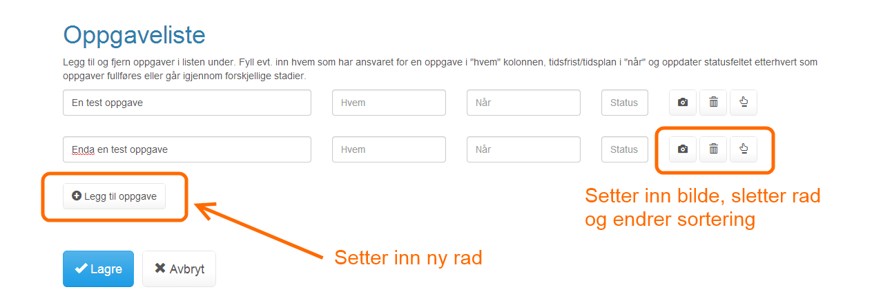
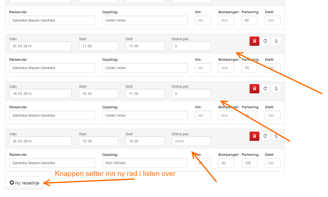
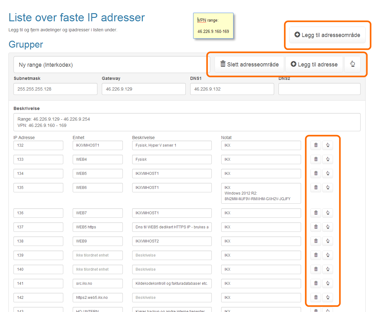
f.Write(data); Creating Arrays With the DATA-ARRAY and DATA-ACTION Attributes
Arrays or structured forms can be created with a data-array attribute. This causes the plugin to automatically recognize child elements inside the data-array as repeatable.
ATTENTION: All attributes must be in lowercase.
data-array attribute
Used to define lists that can add and remove "rows" in the forms.
<div data-array="List">
    <div>
        <label>Enter Name:</label> <input type="text" name="Name" />
        <button data-action="delete"></button>
    </div>
</div>
<button data-action="add" data-target="List">Add name</button>
<!-- This example shows how to make a list where you can add and delete names -->
Can be combined with the following detail-attributes:
Attribute | Type | Description |
|---|---|---|
data-remove | bool | Empty or "1". Not required. |
data-clear | bool | Empty or "1". Not required. |
data-type | string | Optional specify the type of items in this array. This will make it possible to drag and drop items between other lists of same type in the document. |
data-sync | string | Optional: Specify name of other array to sync list with. The sync attribute is a one way sync, for two way sync specify the sync attribute on both elements with "data-array" attrbiutes. |
data-autoinsert | bool | Empty or "1". Not required. Specifies that an empty row should be displayed at the bottom. When data is entered a new row is inserted below this row. Always making a new row for inserting additional data available. The empty row is not returned when using the form.Read() function. |
Other related attributes:
Attribute | Type | Description |
|---|---|---|
data-noarray | bool | Empty or "1". Not required. Add to children array-elements that are static elements that should not be modified inside the element list. |
data-copyprevious | bool | Empty or "1". Not required. Specifies that every new item inserted should copy the previous. May be added to any form elements. Such as input, select, data-func="input", data-func="camera" etc. |
data-remove="1"
If combined with the data-array atttribute, then data-remove will by default empty the elements inside the array for all new documents. The child elements must be in the template to define what you can create in the array. At initialization, Smartform will store these in memory and remove them from DOM.
The following example will empty the "Elements" array on form intitialization.
<div class="form-group" data-array="Elements" data-remove="1">
    <div>
        <label>An item</label>
        <input type="text" name="Title" />
        <a class="btn btn-default btn-sm" data-action="delete"></a>
    </div>
</div> data-clear="1"
Use this attribute for data-array elements to indicate that any new rows that are inserted must be cleared of values. This is typically done if there are one or more standard example rows in an array with sample data.
The example below creates a list with 3 pre-filled rows. When you click New, a new empty row is added. If "data-clear" had not been set a copy of the first row would have been inserted. Here, "Spring" would have been added.
<div data-array="Seasons" data-clear="1">
    <div>
        <input name="Season" type="text" value="Summer" placeholder="Season name" />
    </div>
    <div>
        <input name="Season" type="text" value="Winter" placeholder="Season name" />
    </div>
    <div>
        <input name="Season" type="text" value="Autumn" placeholder="Season name" />
    </div>
</div>
<button data-action="add" data-target="Season">New Season</button> data-type and data-template
The example below will create 2 arrays where you can create items in array 1 and then drag items over to array 2.
<h2>List 1</h2>
<div data-array="Seasons1">
    <div>
        <input name="Season" type="text" />
    </div>
</div>
<h2>List 2</h2>
<div data-array="Seasons2" data-type="Seasons" data-template="Seasons1"></div> <!-- Make a list copy -->
<button data-action="add" data-target="Seasons1">New Season</button> data-sync="arrayname"
Populates the array with items and values from another array. May also be used without the data-array attribute, see example.
Must be combined with elements using the data-bind="fieldname" attributes.
See example below:
<div class="row">
<div class="col-sm-6">
<h2>Array #1</h2>
<div data-array="List">
<div>
<label>An item</label> <a class="btn btn-default btn-sm" data-action="remove"></a>
<input type="text" name="Title" placeholder="Enter title" class="form-control" />
<hr/>
</div>
</div>
<a class="btn btn-default" data-action="add" data-target="List">Add item</a>
</div>
<div class="col-sm-6">
<h2>Array #2 <small>Connected "Array #1" by sync</small></h2>
<table class="table table-striped table-bordered">
<thead>
<tr data-sync="List"> <!-- Not stored as data, only displayed -->
<td data-bind="Title" data-placeholder="No title entered"></td>
</tr>
</thead>
<tbody>
<tr data-array="Values" data-sync="List"> <!-- Generated dynamic list and stored in field -->
<td data-name="Value" data-func="input" data-placeholder="Enter a value"></td>
</tr>
</tbody>
</table>
</div>
</div> See live demo here: https://dops.docly.net/data-sync-demo
Structured / Recursive list example
<p>Add and remove items to the recursive list below:</p>
<ul data-array="Elements">
    <li>
        <span data-func="input" data-placeholder="Enter text"></span>
        <button data-action="add" data-target="Elements">Add sub item</button>
        <button data-action="delete" data-target="Elements"></button>
        <ul data-array="Elements" data-type="Elements" data-template="Elements"></ul>
    </li>
</ul>
<button data-action="add" data-target="Elements">Add item</button>
For a live example, please see: https://dops.docly.net/Recursive-array-demo
data-action attribute
The data-action attribute adds array functions. It is typically used on <a> and <button> elements, but can be applied to all HTML elements.
data-action commands
add | Used in combination with data-target attribute. Adds a new row. See also: "data-variant" attribute to support multiple types of items in an array. |
remove | Removes the array element that it is contained within. If it is not empty (ie, the form has values entered) will display a warning first. |
sort | Allows the user to drag-and-drop, to sort rows in arrays. |
clone | Duplicates the array element that it is contained within. |
Examples of data-action buttons
Example buttons:
<div data-array="List">
    <div>Enter name: <input name="Name" /></div>
</div>
<button data-action="add">Add item</button> data-action="add"
Data-target
This attribute is used in combination with data-action = "add". It refers to the array that data-action should target.
<div data-array="List">
    <label>Item title</label>
    <input type="text" name="Title" />
    <hr/>
</div>

<a class="btn btn-default" data-action="add" data-target="List">Add item</a>
See live demo: https://dops.docly.net/data-array-Simple-demo
Data-variant
Provides support for different data types within a single array.
<div data-array="Items" data-remove="1">
    <div data-variant="Car" class="alert alert-info">
        <div class="pull-right">
            <button data-action="delete"></button><button data-action="sort"></button></div>
            <label>This is a car</label>
            <input name="Reg" placeholder="Enter regno of car">
        </div>
        <div data-variant="Bike" class="alert alert-success">
            <div class="pull-right"><button data-action="delete"></button><button data-action="sort"></button>
        </div>
        <label>This is an employee</label>
        <input name="Name" placeholder="Enter name of employee">
    </div>
</div>

<button data-action="add" data-variant="Car" data-target="Items">Add car</button>
<button data-action="add" data-variant="Bike" data-target="Items">Add employee</button>
For a live demo, see: https://smartform.ikx.no/Array-Examples/Data-variant-demo
Data-focusinsert
Use this attribute to make common toolbars operate over many arrays based on what elements are focused within a document.
<h2>Click "Subitems" and then click the add button to add sub items</h2>
<div data-array="List" tabindex="0">
<div class="well">
<label>Item title</label>
<input type="text" name="Title" />
<hr/>
<div data-array="List" data-type="List" tabindex="0" data-placeholder="No sub items"></div>
</div>
</div>
<a class="btn btn-default" data-action="add" data-focusinsert="1" data-target="List">Add item</a> See live demo: https://tech.docly.net/data-focusinsert-demo
data-action="remove", "sort" and "clone"
See data-type attribute regarding moving items between lists of similar type with data-action="sort".
<p class="lead">This is a simple demo form</p>

<table class="table table-striped">
    <tbody data-array="Rows">
        <tr>
            <td data-func="html" data-name="Name" data-placeholder="Enter name"></td>
            <td data-func="html" data-name="Value" data-placeholder="Enter value"></td>
            <td>
                <a class="btn btn-default" data-action="duplicate"></a>
                <a class="btn btn-default" data-action="remove"></a>
                <a class="btn btn-default" data-action="sort"></a>
            </td>
        </tr>
    </tbody>
</table>
<a class="btn btn-default" data-target="Rows" data-action="Add"></a>
For live demo, see: https://dops.docly.net/data-array-Simple-demo
Options for data-remove:
Parameter | Description |
|---|---|
data-target | OPTIONAL - Name of array to target. If set will always remove last item in this array. |
data-container | OPTIONAL - Must be combined with data-target. If data-target is not an unique name you can specify q jquery selector to specify the container matched with the jQuery closest function. |
data-action="link"
This should be placed on <select data-action="link" ...../>
With or without the "multiple" attribute.
Links items in arrays together (same or different array). Supports bidirectional link. This is performed with an instance of the SELECT2 dropdown (v4). Single or multiple links are supported (multiple attribute).
data-target | "Type name" of data-array to link to. Searches within the first container outside the current data-array. The type name is used, and not the data-array name, so content from multiple and recursive lists are retrieved. |
data-idfield | Field name of unique identifier in the target list. |
data-labelfield | Field name of field with display label in the target list. |
data-linkbackfield | OPTIONAL: For two way links. The name of the field in the target list where a link to the source item should be added. Make sure to put the ID field in the top of data-array items, as it is the first one found that will be used. |
data-container | OPTIONAL: jQuery selector to find container using the jQuery closest function. $container = \((this).closest(\)(this).attr("data-container")); |
For live demo, see: https://dops.docly.net/Link-action-demo
data-action="variant"
Makes a dropdown box into a item variant type changer. Must be combined with the reserved field name "ObjectVariant".
<select name="ObjectVariant" data-action="variant">
    <option>Variant 1</option>
    <option>Variant 2</option>
</select>
When value is changed the corrent element containing the select box will change variant. Any matching fields will get values transferred.
See also chapter "Changing variant of array item by code (JS)".
For live demo, see: http://tech.docly.net/Variant-Selector
data-glyphicon
Specifies an icon different from the Smartform.JS default icon. This applies to all data-action commands.
Selects a Bootstrap Glyphicon to be displayed. See the chart on http://getbootstrap.com/components/ Specify only the name shown on page after the glyphicon example.
Ex: "glyphicon-xxxx" Only the portion of the string after " glyphicon- " needs to be specified.
<a data-action="add" data-target="Images" data-glyphicon="camera">Add Image</a>
Recursive Arrays
By using the data-template attribute, you can specify another existing template page. If you do this with a template that contains itself, a recursive list is automatically created.
<p>Add and remove items to the recursive list below:</p>
<ul data-array="Elements">
    <li>
        <span data-func="input" data-placeholder="Enter text"></span>
        <button data-action="add" data-target="Elements">Add sub item</button>
        <button data-action="delete" data-target="Elements"></button>
        <ul data-array="Elements" data-type="Elements" data-template="Elements"></ul>
    </li>
</ul>
<button data-action="add" data-target="Elements">Add item</button>
For a live example, see: https://dops.docly.net/Recrusive-array-demo
Avoiding Autofocus on Fields / Buttons
Use the class "skipautofocus". See example below:
<div data-array="List">
    <div>
        <span class="skipautofocus">
            <button data-action="delete"></button>
            <button data-action="sort"></button>
        </span>
        <input name="Field" />
    </div>
</div>
<button data-action="add" data-target="List">Add item</button>
This can be set directly on an element, or on a container to skip all child field elements.
Changing arrays by code (JS)
Arrays can be changed by JS code. See examples below.
Adding an item to array by code (JS)
<!-- Adds a new item to specified array, with the following specified data. -->
<form>
    <ul data-array="Items" id="somearray">
        <li><input name="Title" placeholder="Enter title"/></li>
    </ul>
</form>
<script>
    var $form = $("form").smartform();
    $form.AddItem($("#somearray"), {Title:"This is an inserted item"});
</script>
For live demo, see: https://tech.docly.net/Adding-Item-By-Code
Changing variant of array item by code (JS)
To change between item variants (or types) use the following code:
<form>
<div data-array="Items" data-remove="1" data-placeholder="No items, click add below!">
<div class="a alert alert-info" data-variant="A">
Type A: <span class="btn converta btn-xs btn-default">Convert</span>
<input name="Title" placeholder="Enter title"/>
</div>
<div class="b alert alert-success" data-variant="B">
Type B: <span class="btn convertb btn-xs btn-default">Convert</span>
<input name="Title" placeholder="Enter title"/>
</div>
</div>
<a class="btn btn-info" data-action="add" data-variant="A" data-target="Items">Add "A"</a>
<a class="btn btn-success" data-action="add" data-variant="B" data-target="Items">Add "B"</a>
</form>
<script>
var $form = $("form").smartform();
$form.on("attach", function(e, $el, $f) {
$el.find(".converta").on("click", function() { $form.ChangeVariant($el, "B"); });
$el.find(".convertb").on("click", function() { $form.ChangeVariant($el, "A"); });
});
</script> For live demo, see: https://tech.docly.net/Change-Variant-By-Code
DATA-FUNC Attribute - Extra HTML5 Features
Smartform JS contains various powerful HTML5 extensions, allowing you to add advanced functionality with ease!
Overview of Key Functions
The table below contains an overview of some important DATA-FUNC components:
Function Name | Function Category | Description |
|---|---|---|
camera | Image-function | Adds a camera button. Read more about image processing further down. |
pasteimg | Image-function | Saves the image; similar to "camera" function and has the same attributes. This adds the image from the clipboard and displays an error message if there is no image in the clipboard. |
sketch | Signature-entry | Saves an image similar to "camera". When the button is clicked, opens "sketch pad" in fullscreen. The sketch is saved as an image, like in "camera". This may also be combined with the "pasteimg" and "camera" buttons. |
collapse | Show/hide | Adds buttons to easily hide / expand the areas in the document. This expand-state is also stored in the document. |
autogrow | Auto expand | Automatically expands the height of <textarea> fields to fit their text contents. |
document | Link | For <input type = "number" /> fields. Shows a dropdown with links to other documents. Can be combined with the "data-acceptable" type attribute (using a comma separated list of accepted document templates). |
input | Editing | Causes HTML tags to behave as editable fields. Can be used on most types of tag, typically <div> <td> <p>. To function, must have the data-name attribute set within the tag. Can be combined with data-placeholder, to add an HTML5 placeholder-like label. |
reqvalidate | Validator | Finds the "data-target" and checks that the field has the value specified. If not, the first invalid validator is shown and focused. The validators are all automatically hidden at form initialize. |
file | File upload | Allows user to select any local file and upload it the to server. The file can later be downloaded, or merged into downloads or e-mail delivery. |
guid | Creates a GUID | Creates a globally-unique identifier value for an item or field. This is normally used for hidden fields. |
focus | Set focus to child | When element is clicked, it finds the first focusable child-element and sets focus there. Useful for creating a more user-friendly experience, by allowing the user to focus the cursor by clicking a larger area. |
popoverbar | BootStrap Framework Popover | Put advanced or additional fields/information in a popover for your items. Show the popover from a button or when selecting/focusing items. |
gps | GPS location | Stores the user's current GPS coordinates in a form field. Allowing the user to tag his current GPS position. Not supported on all devices. See http://www.w3schools.com/html/html5_geolocation.asp |
CAMERA, SKETCH, PASTEIMG - HTML5 Image Functions
Camera and pasteimg functions are called in the first <article> tag, or the first array item in the closest data array. See the examples below:
Options and Validation
The following additional attributes are for the validation of image fields:
data-img | string | REQUIRED - Reference to a <img> element that has the value specified in data-name attribute (see examples below). |
data-noimg | string | REQUIRED - Reference to an element with the value specified in data-name attribute (see examples below). The item will be shown when there is no image set, otherwise it is hidden. |
data-imgres | string | OPTIONAL - Dimensions for the image, formatted as in "420x300" (lowercase 'x' character). If the image does not satisfy this format, it will be rejected. The camera in the PhoneGap API will automatically be called with this value as the size parameter. If an error occurs, file upload and pasteimg will display the error message. |
data-imgminres | string | OPTIONAL - Operates like data-imgres, with the image being accepted if its width is greater than or equal to a minimum width, and height is >= a minimum height. These minimums are specified in the format specified above, i.e., "32x32" (lowercase 'x' character). |
data-imgquality | int | OPTIONAL - PhoneGap API: This is a .jpeg quality value, range 0 to 100. If this value isn't set, the default value of 75 is used. |
Examples
Below are some examples of the optional validation functions: imgres, imgminres, and imgquality:
<h2>data-imgres attribute</h2>
<p>This field only accepts a 640x480 resolution image.</p>
<span>
    <img class="img-thumbnail" alt="An image" data-name="Image1" />
    <a class="btn btn-primary" data-func="camera" data-img="Image1" data-noimg="noimg" data-name="noimg" data-imgres="640x480"></a>
</span> <h2>data-imgminres attribute</h2>
<p>This field does not accept images below 1920x1280 resolution.</p>
<span>
<img class="img-thumbnail" alt="An image" data-name="Image2" />
<a class="btn btn-primary" data-func="camera" data-img="Image2" data-noimg="noimg2" data-name="noimg2" data-imgminres="1920x1280"></a>
</span> <h2>data-imgquality</h2>
<p>Sets the JPEG quality to 99 for Phonegap compiled apps.</p>
<span>
<img class="img-thumbnail" alt="An image" data-name="Image3" />
<a class="btn btn-primary" data-func="camera" data-img="Image3" data-noimg="noimg3" data-name="noimg3" data-imgquality="99"></a>
</span> For a live demo of the optional image validation functions, see: https://dops.docly.net/Imgres-demo
CAMERA
Adds camera button images. See the example.
<h1>Please take a picture below:</h1>
<p>Will open camera on mobile devices.</p>

<span>
    <img class="img-thumbnail" alt="Bilde" data-name="Bilde" />
    <a class="btn btn-primary" data-func="camera" data-img="Bilde" data-noimg="noimg" data-name="noimg"></a>
</span>
For a live demo, see: https://dops.docly.net/Camera-demo
PASTEIMG
Pastes an image from clipboard, if available. Displays the error message defined in "data-ErrorMsg" if there is no image in the clipboard. See example below:
<article> <!-- IMPORTANT! PASTEIMG will operate within first article tag OR an item element within a data-array (container) -->
    <div class="row form-group" data-array="Images" data-remove="1">
        <div class="col-xs-4 col-sm-4 col-md-2 col-lg-2">
            <img class="img-thumbnail" alt="Image" data-name="Image" />
                <span data-name="noimg">
                    <a class="btn btn-primary" data-func="pasteimg" data-img="Image" data-noimg="noimg"></a>
                    <a class="btn btn-default" data-action="delete"></a>
                </span>
            </div>
        </div>
    <button data-action="add" data-target="Images">Add Image</button>
</article>
SKETCH
The "sketch" function is mainly used for signing a document by-hand. On mobile platforms, it opens a touchscreen where the user can write their signature with their finger or a stylus. On desktop platforms, the same window is opened, and the mouse is used for input. See the example code below:
For a live demo of SKETCH, see: https://dops.docly.net/sketch-demo
PASTEIMG and CAMERA combined
<article> <!-- IMPORTANT! Pasteimg and camera will only operate with each other when they are inside same article tag OR they both occupy same item element within a data-array (container) -->
    <div class="row form-group" data-array="Images" data-remove="1">
        <div class="col-xs-4 col-sm-4 col-md-2 col-lg-2">
            <img class="img-thumbnail" alt="Image" data-name="Image" />
            <span data-name="noimg">
                <a class="btn btn-primary" data-func="camera" data-img="Image" data-noimg="noimg"></a>
                <a class="btn btn-primary" data-func="pasteimg" data-img="Image" data-noimg="noimg"></a>
                <a class="btn btn-default" data-action="delete"></a>
            </span>
        </div>
    </div>
    <button data-action="add" data-target="Images">Add Image</button>
</article>
See live demo at: https://dops.docly.net/pasteimg-camera-demo
AUTOGROW - Dynamically Sized <textarea>'s
The "autogrow" parameter can be set for <textarea> tags. This will cause the textarea to seamlessly expand, when necessitated by user-input. When text is deleted, the textarea will automatically shrink to best-fit.
<textarea name="Text" data-func="autogrow"></textarea>
See live demo at: https://dops.docly.net/autogrow-demo
COLLAPSE - Collapse/Expand Areas
Expands and collapses an area within a container. Works inside form arrays. See below:
COLLAPSE in action!
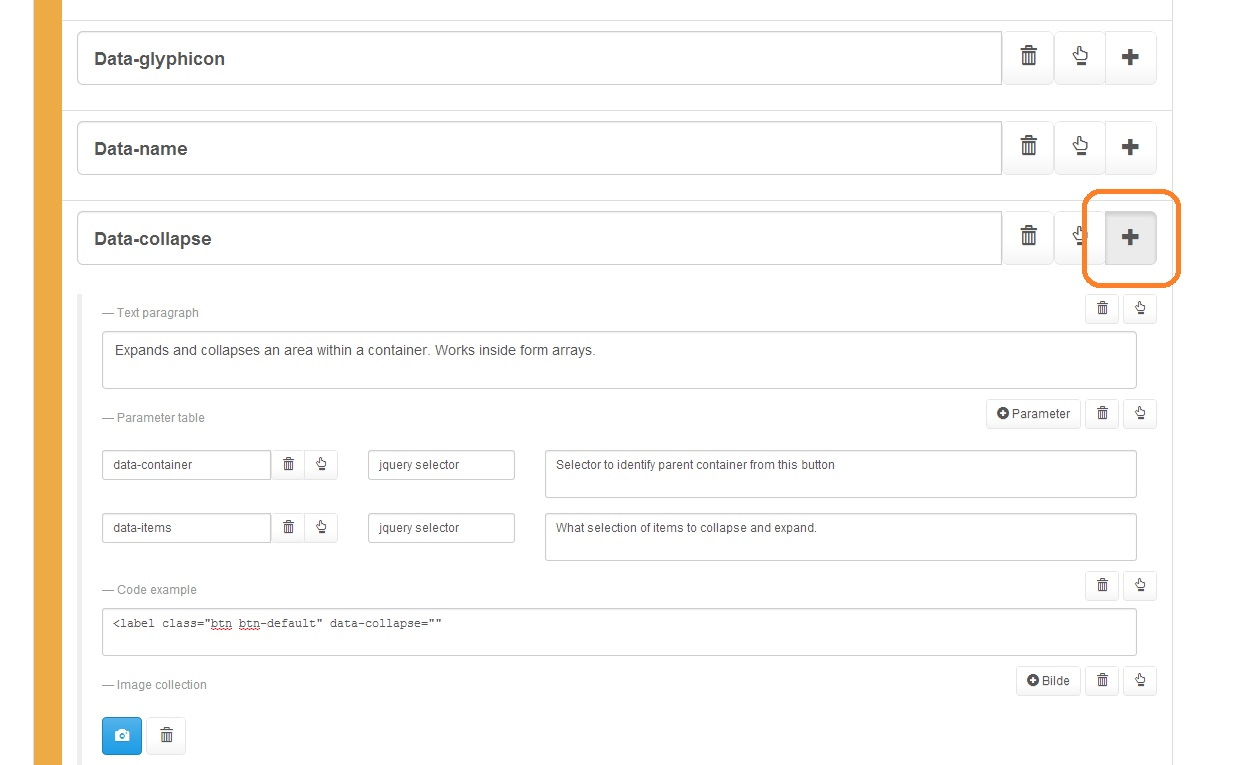
COLLAPSE Attributes:
Name | Type | Description |
|---|---|---|
data-container | jquery selector | Selector to identify parent container from this element. The container is selected with the "closest" jquery function. |
data-body | jquery selector | The selected elements to collapse and expand within the container. Selection is performed from the container element with the jquery "find" function. |
See live demo #1 at: https://dops.docly.net/data-func-collapse
See live demo #2 at: https://dops.docly.net/expand-collapse-demo
RADIO - Mutually Exclusive Buttons
The "radio" function creates a set of mutually exclusive buttons. These buttons behave as radio-buttons, where only one option may be selected at any time. See example code below:
<div class="btn-group" data-toggle="buttons" data-func="radio">
    <label class="btn btn-default">
        <input type="checkbox" name="OK" />
        <span class="glyphicon glyphicon-ok"></span> OK
    </label>
    <label class="btn btn-default">
        <input type="checkbox" name="Pass" />
        <span class="glyphicon glyphicon-remove"></span> Pass
    </label>
    <label class="btn btn-default">
        <input type="checkbox" name="Fail" />
        <span class="glyphicon glyphicon-thumbs-down"></span> Fail
    </label>
</div>
Check out the live demo of RADIO at: https://dops.docly.net/radio-checkbox-demo
INPUT - Editable HTML Elements
The "input" function creates an HTML element that the user can edit. Additionally, you can supply a placeholder string to display when the element is unedited.
Name | Type | Description |
|---|---|---|
data-name | string | REQUIRED - Name of form field |
data-placeholder | string | OPTIONAL - Placeholder text for when field is unedited. Disappears as soon as the user modifies the field. |
data-format | string | OPTIONAL - String representing type of data for the field. Must be one of "text", "html" or "number" (lowercase). The default value is "text". |
data-deleteempty | bool | OPTIONAL - Disabled when set to empty string, or when not set. If any value is set, data-deleteempty is enabled, and has boolean value 'true'. When enabled, it will remove the closest data-array element if the user clears and blurs the field. At that point, a dialog box will be shown to confirm deletion. |
readonly | OPTIONAL - If present data will only be bound to the field. Content will not be editable. | |
data-nolinebreak | bool | OPTIONAL - Will not allow ENTER (mulitple lines in text). When located in a grid within a grid with data-autoinsert enter will insert a new line. Pasting multiple lines will insert them in the same column. |
See the example code below:
<label>Enter text in the div below</label><br>
<div class="well well-sm" data-action="input" data-name="InputField1" data-placeholder="You can enter text here inside this div element"></div>
<h2><table> example</h2>
<table class="table table-striped table-bordered">
<thead>
<tr>
<th>Key</th>
<th>Value</th>
</tr>
</thead>
<tbody data-array="Table1">
<tr>
<td data-action="input" data-name="Key" data-placeholder="Enter key name"></td>
<td data-action="input" data-name="Value" data-placeholder="Enter value" data-deleteempty="1">Delete this value and exit the field.</td>
</tr>
</tbody>
</table>
<button data-action="add" data-target="Table1">Add new row</button>
<p>
The value column is marked with "data-deleteempty" attribute. Meaning that if you enter
a value and afterwards clear the field, it will delete the table row.
</p> Readonly example:
Show title (readonly):<br />
<div readonly data-func="input" data-name="Title"></div>
Check out the "input" function in action at https://dops.docly.net/Input-field-demo
REQVALIDATE - Required Field Validator
This function is executed by the $form.Validate() function. A popover will be shown if there is no value in the target field. The target field is specified in data-target attribute, and the error message is (optionally) set in data-message attribute.
Name | Type | Description |
|---|---|---|
data-target | string | REQUIRED - Name of the form field to validate. |
data-message | string | OPTIONAL - An error message that is displayed if the target field has no value. |
data-container | string | OPTIONAL - jQuery selector to specify where the error popover should be displayed. Must be used for fields that may be hidden not validating (such as file upload fields). |
<br /><br/>
<span data-func="reqvalidate" data-target="Field1" data-message="Field1 has to have a value!">
<input name="Field1" placeholder="Empty field, click validate form button." readonly="readonly" style="width:20em;display:inline-block" />
</span>
<br/><br/>
<a class="btn btn-primary validatebtn">Validate form</a>
For a live demo of "reqvalidate", check out: https://dops.docly.net/Validate-reqvalidate-demo
FILE - File Upload Function
This function creates a button/field where the user can upload a file. When clicked on, the "browse files" interface will be shown, and the file selected by the user will be uploaded when the form is submitted.
Please see the example code below:
Name | Type | Description |
|---|---|---|
data-file | id (string) | Id for other element with this values set in the data-name attribute. Element to display when a file has been selected. |
data-nofile | id (string) | Id for other element with this values set in the data-name attribute. Element to display when a field is not selected. |
data-filename | id (string) | Id for other input element with this values set in the data-name attribute. Other input field to store filename in. Actual filenames stored on server are stored using GUIDs. So to store both file and filename 2 seperate fields must be used. |
data-ccept | string | List of supported extensions. Is directly mapped to the "accept" attribute on the <input type="file"> tag. |
<span class="glyphicon glyphicon-paperclip" data-name="File"></span>
<a data-name="nofile" data-func="file" data-file="File" data-nofile="nofile" class="btn btn-default"></a>
For a live demo of file-upload, see: https://dops.docly.net/File-upload-demo
TEMPLATE - Copy Content from Another Element
The "template" function will copy the content from another element into its own element. The "data-template" attribute must be equal to "data-name" attribute of the element to copy. This function helps to keep the form markup cleaner, and avoids some repeated content.
data-func | string | REQUIRED - MUST have value "template". |
data-template | string | REQUIRED - Name of the element to copy content from. |
<p data-name="Template1">
This is an example template
</p>
<p class="text-muted">Below the contents of the paragraph below will be copied:</p>
<p data-func="template" data-template="Template1"></p>
For a demo of copying with "template", see: https://dops.docly.net/Template-function-demo
FOCUS - Redirects Click to Focus Child Element
Clicking on a bounding element redirects the focus to the closest focusable child. See the example code below:
<div class="alert alert-success" data-action="focus">
Clicking anywhere on this green box will automatically set focus to the field below, as it is the first field in this element.
<br><br>
<input name="TestField" />
<br>
<div class="well well-sm">
Clicking in this box wont set the focus, as it does not capture clicks for other children elements.
</div>
</div>
For a live demo of focus, see: https://dops.docly.net/Focus-function-demo
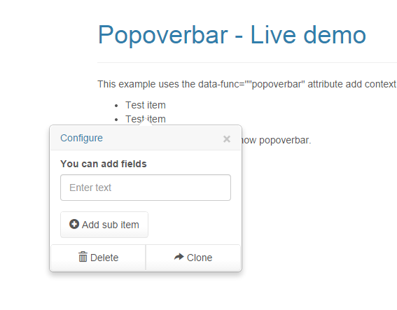
POPOVERBAR - Add Popover Menus
The popover is a Bootstrap Framework special dropdown menu. With this function, you can add more advanced options than you could fit in the screen otherwise. The popover function can be triggered with click, focus, or any time you require it. See the example code below:
Trigger showing the menu by using jquery .trigger("popover") on any child element within the item.
To hide the menu use .trigger("depopover")
POPOVERBAR Example:
Name | Type | Description |
|---|---|---|
data-func | string | REQUIRED: Must have value "popoverbar" |
data-target | string | REQUIRED: Name of common toolbar to use for this popover |
data-container | jquery selector | OPTIONAL: Name of parent to container that the popover arrow should point to (uses jquery closest(your value) to find the parent element). |
data-placement | string | OPTIONAL: One of the following values "bottom" (default value), "top", "left" or "right". Where the popover will be placed relative to the container element. |
data-attachto | jquery selector | OPTIONAL: Must be used for data-array elements with multiple popovers. Specifies which element the popover/depopover events will be triggered. (Uses jquery closest(your value) to find the parent element). |
For example code, and a live demo of POPOVERBAR, see: https://dops.docly.net/Popoverbar-demo
GPS - Store current GPS location
Name | Type | Description |
|---|---|---|
data-func | string | REQUIRED: Must have value "gps" |
data-name | string | REQUIRED: Name of field to store coordinate in. |
data-glyphicon | string | OPTIONAL: Specify bootstrap glyphicon for button. If not specified the "map-marker" icon will be used. See the chart on http://getbootstrap.com/components/ Specify only the name shown on page after the glyphicon example. Specify "none" for no icon. |
<a class="btn btn-default" data-func="gps" data-name="GpsLocation"></a>
For a live demo of GPS function, see: http://tech.docly.net/GPS-function-demo
Grid - Excel-like key navigation in table
Applies Excel-like keyboard navigation to tables with input fields in rows and columns.
Add the data-func="grid" attribute to the table as shown below:
<table class="table table-striped" data-func="grid">
    <tbody data-array="Rows" data-autoinsert="1" data-remove="1">
        <tr>
            <td data-func="input" data-name="Name" data-placeholder="Enter name"></td>
            <td data-func="input" data-name="Address" data-placeholder="Enter Address"></td>
            <td data-func="input" data-name="City" data-placeholder="Enter city"></td>
            <td data-func="input" data-name="ZIP" data-placeholder="Enter ZIP code"></td>
        </tr>
    </tbody>
</table>
For a live demo of GRID function, see: http://tech.docly.net/Grid-function-demo
The arrows on the keyboard will behave like this:
Up - Moves to the first editable field in the same column. If at top row in table nothing happens.
Down - Moves down to the next editable row. If at bottom within table nothing happens.
Left - If at the far left of content or the entire cell is selected the cursor moves to the previous column.
Right - If at the far right of content or the entire cell is selected the cursor moves to the next column.
When moving from one cell to another, all the content in the next cell input is selected.
The data-func="grid" function works great combined with the "data-autoinsert" if the table contains a "data-array".
This feature only works in combination with input fields in the table cells.
Experimental stage, subject to change.
Javascript Events
There are various functions that can be decalared globally in the page (under window). There will automatically be called by Smartform JS objects, by following predefined events.
function AttachDocEvents($element) - Attach Event Handlers
This function is called every time a new array element is created in the form. Attach your desired event handlers to the DOM element.
$element | jquery element | Element that is added to an array. Attach any event handlers here, for new elements added. This function is called when the user adds new rows, as well as when the form loader restores content with the Read() function. |
<script>
    function AttachDocEvents($e) {
        $e.find("input[name=Expand]").on("change", function () {
        var $t = $(this);
        var $sec = $t.closest("section").find(".collapsable");
        if ($t.prop("checked")) {
            $sec.show();
            $sec.find("textarea").trigger("change");
        }
        else $sec.hide();
    });
}
</script> function UpdateFormGUI - Perform Calculations and Update Graphical Elements
Is an asynchronous function called 250ms after the last change to the form has been made. This prevents it from being called all the time. See example code below:
function UpdateFormGUI() {
    // Update counters
    $(".count1,.count3").each(function(index, item) {
        var $t = $(this);
        var v = $t.closest("[data-array]>*").find("[data-action=link]").select2("val");
        $t.text(v.length);
    });
}
event Attach(e, $element, $form)
Is triggered when attaching event handlers to specified element. Before any values have been written to any fields.
$form.on("attach", function(e, $element, $form) {
  $element.find(".btn").on("click", function() { alert("Clicked button!"); });
});
event Added(e, $element, $form)
Is fired whenever a new element is added to an array within the form. After event handlers have been attached and any values written to fields.
Use it to for example attach event handlers, see example:
$form.on("added", function(e, $element, $form) {
  $element.find(".btn").on("click", function() { alert("Clicked button!"); });
});
Parameter | Description | Type |
|---|---|---|
e | jQuery event info object | object |
$element | Reference to the element that was added. | jquery object |
$form | Reference to the smartform instance. | smartform jquery object |
event Removed(e, index, $arr, $removedItem)
Simmillare to the "added" event described above but fired when an array element is removed.
Column | Type | Description |
|---|---|---|
e | jQuery event info object | object |
index | int | Item index in array |
$arr | jquery object | Reference to array element in form |
$removedItem | jquery object | Reference to the removed array element |
$form.on("removed", function(e, index, $arr, $removedItem) {
  alert("Deleted item " + index + " in array: '" + $arr.attr("data-array") + "'");
});
event Modify(e, $element, $form, getFunc, writeFunc)
To fill in for a missing bubbling and uniform event for all field changes, smartform implements a new event called "modify".
It is added to all input types, select and all the smartform extensions (See the "Extra HTML5 Features" chapter) fields.
Because they bubble you can also much simpler check if any field within a container is changed.
$("#MyContainer").on("modify", function(e, $element, $form, getFunc, writeFunc) {
   // Do your magic!
  var value = getFunc(); // Reads value from the modified field

   // You can also set the value but be careful not to trigger a stack overflow here
   if (value == "test") writeFunc("hello");
});
This event is triggered instantly when a field has been modified.
event Modified(e, $form)
This is a async timer triggered event that will fire whenever any value in the form has changed.
Useful for saving drafts locally or continuously to server.
$form.UpdateGuiTimerDelayMs = 250;
$form.on("modified", function(e, $form) {
   // Do your magic!
});
This event is not triggered instantly on changes. It will wait until the form has not modified for the configured delay before triggering the event.
Set the "UpdateGuiTimerDelayMs" setting for configuring this delay.
event LoadComplete(e)
This event is triggered after a "Write" operation to the form has completed.
var $f = $("form").smartform();
$f.on("loadcomplete", function() {
    // Do your magic!
});